
Redesign
When Bryan County Fire & Rescue and the Bryan County Emergency Management Agency became separate departments, Fire & Rescue needed a new standalone visual identity that felt modern, professional, and aligned with the broader Bryan County brand. I was tasked with redesigning the logo to reflect their courage, service, and evolving role in a rapidly growing community.
Project Goals
From the beginning, I wanted the new mark to balance tradition and modernization. Key elements I set out to incorporate included:
Clean, modern lines for digital clarity
A shield silhouette, echoing traditional fire helmet shields
The recognizable hook-and-ladder imagery used across fire departments nationwide
The EMS crest, since ambulance response remains part of Fire & Rescue
A color palette rooted in purpose:
Red for fire service tradition
Bryan County navy blue to align with county branding and uniforms
Golden accents, commonly used among regional fire departments
The first concept I explored was a more traditional fire crest combined with a shield form. As I developed it further, I realized it did not stand out enough visually and needed more impact. That pivot led to three stronger, more refined concepts.

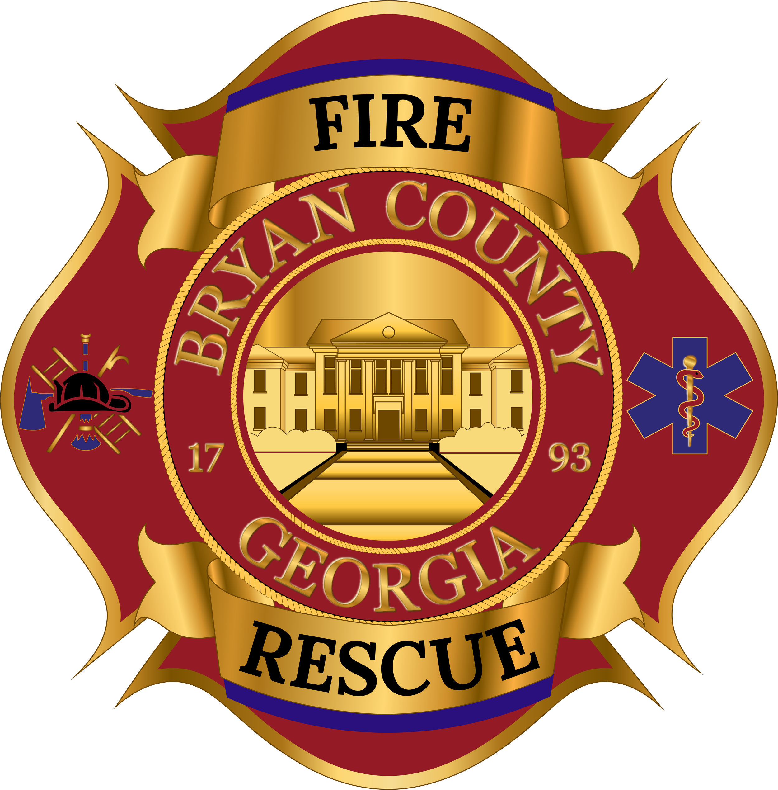
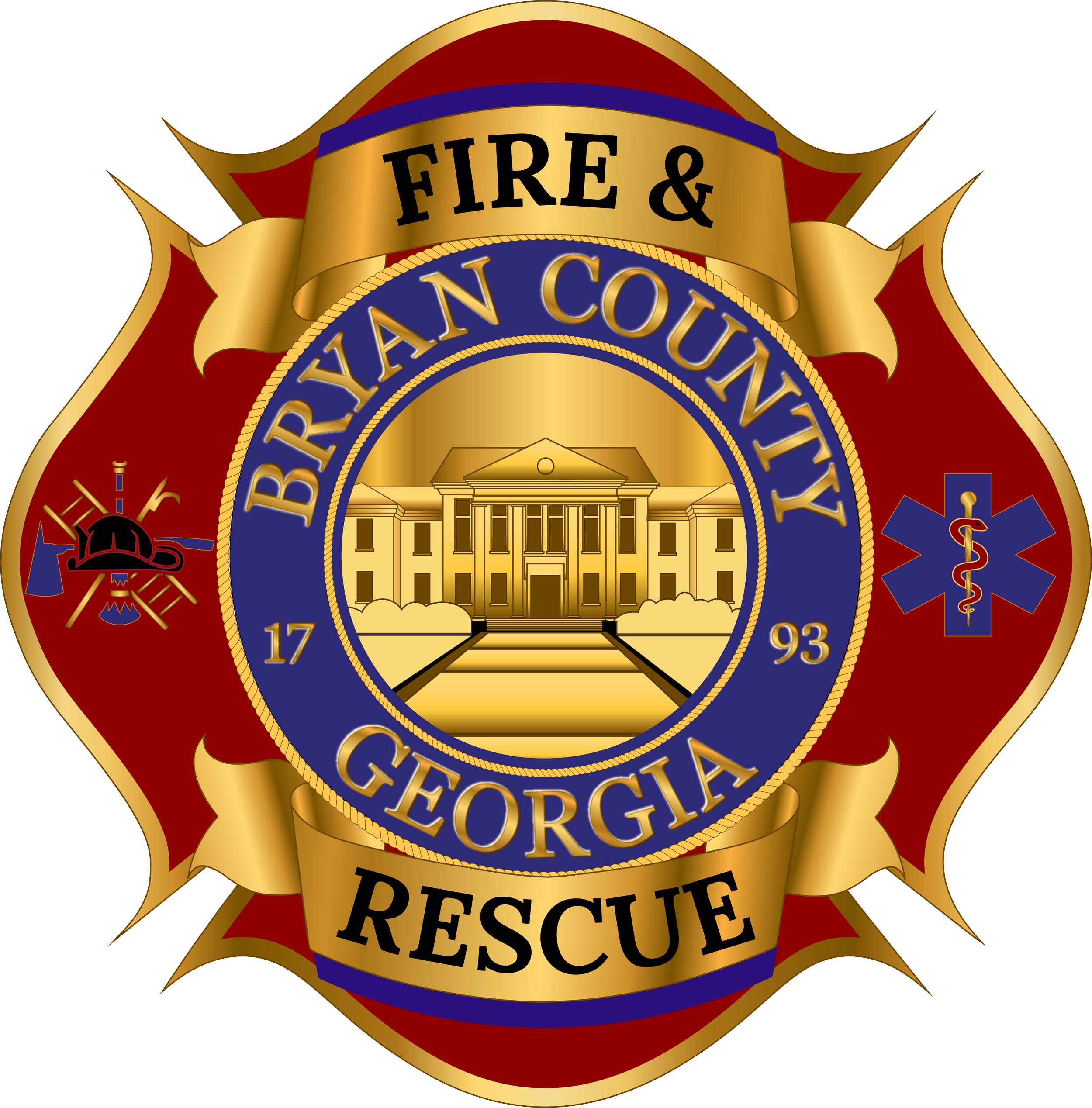
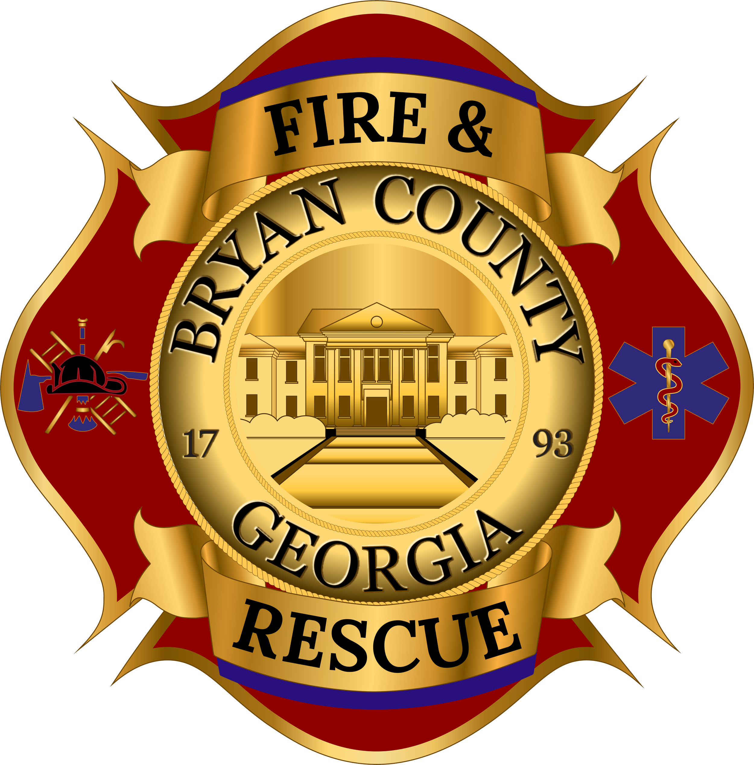
Initial Concepts Presented
I presented leadership with three distinct design options:
A clean, simplified design with bold lines and a straightforward color approach.
A more dynamic option with color gradients, a strong central focus on the hook-and-ladder and EMS crest, and layered depth.
A red and black concept with golden accents, reflecting broader fire-service aesthetic standards across multiple counties.
All options incorporated Bryan County typography, the county’s founding year, and clear badge-style identity elements.
The red-and-blue version tied closest to Bryan County’s existing visual system, while the red-and-black option aligned with fire service traditions seen throughout the region.

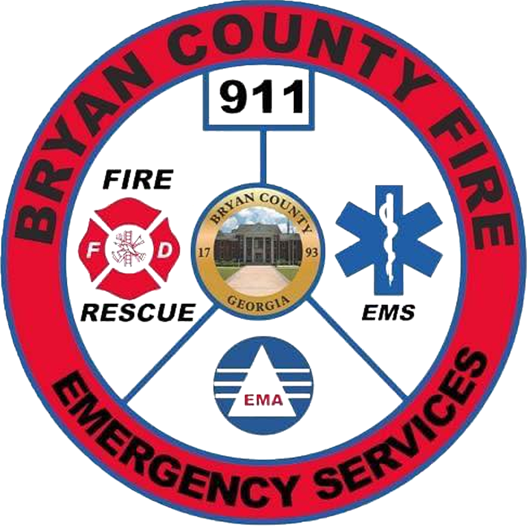
Design Shift & Public Release
During the process, a separate design—created outside of my submissions—was temporarily selected and shared publicly. Although it had not undergone full refinement or formal approval, it became part of the public’s early exposure to the department’s new identity.
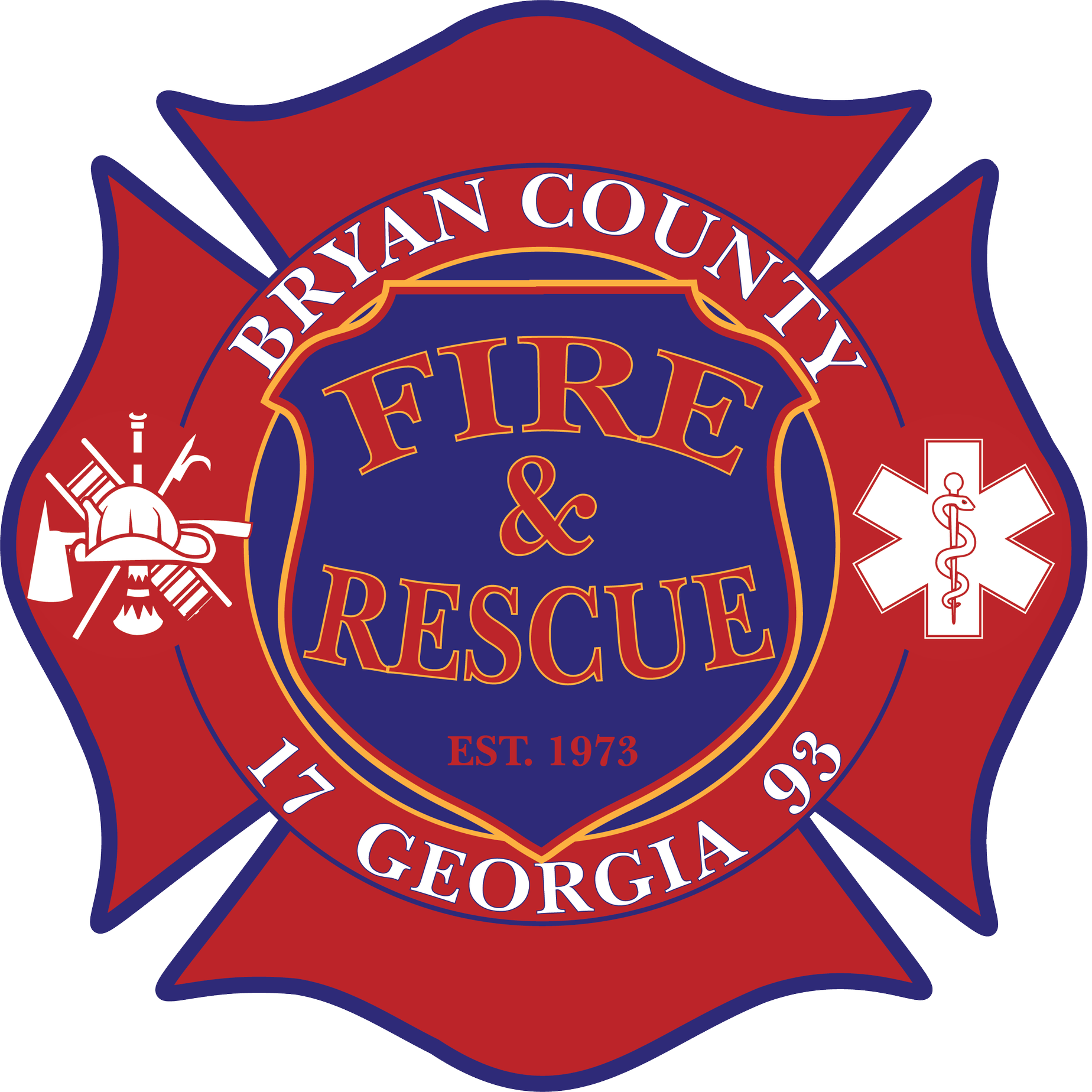
Final Concept Set

Final Redesign Direction
When I was asked to continue developing the logo, it was important to:
Respect the recognizable shape and structure of the temporarily used design
Reduce confusion by maintaining visual continuity
Refine the form into a cleaner, more polished, professionally balanced version
Integrate new directives from leadership
These new directives included:
Incorporating the official Bryan County logo into the center of the fire badge
Adding golden accents requested for visual depth and prestige
Ensuring the presence of the hook-and-ladder and EMS crest imagery
Presenting final options in multiple palettes:
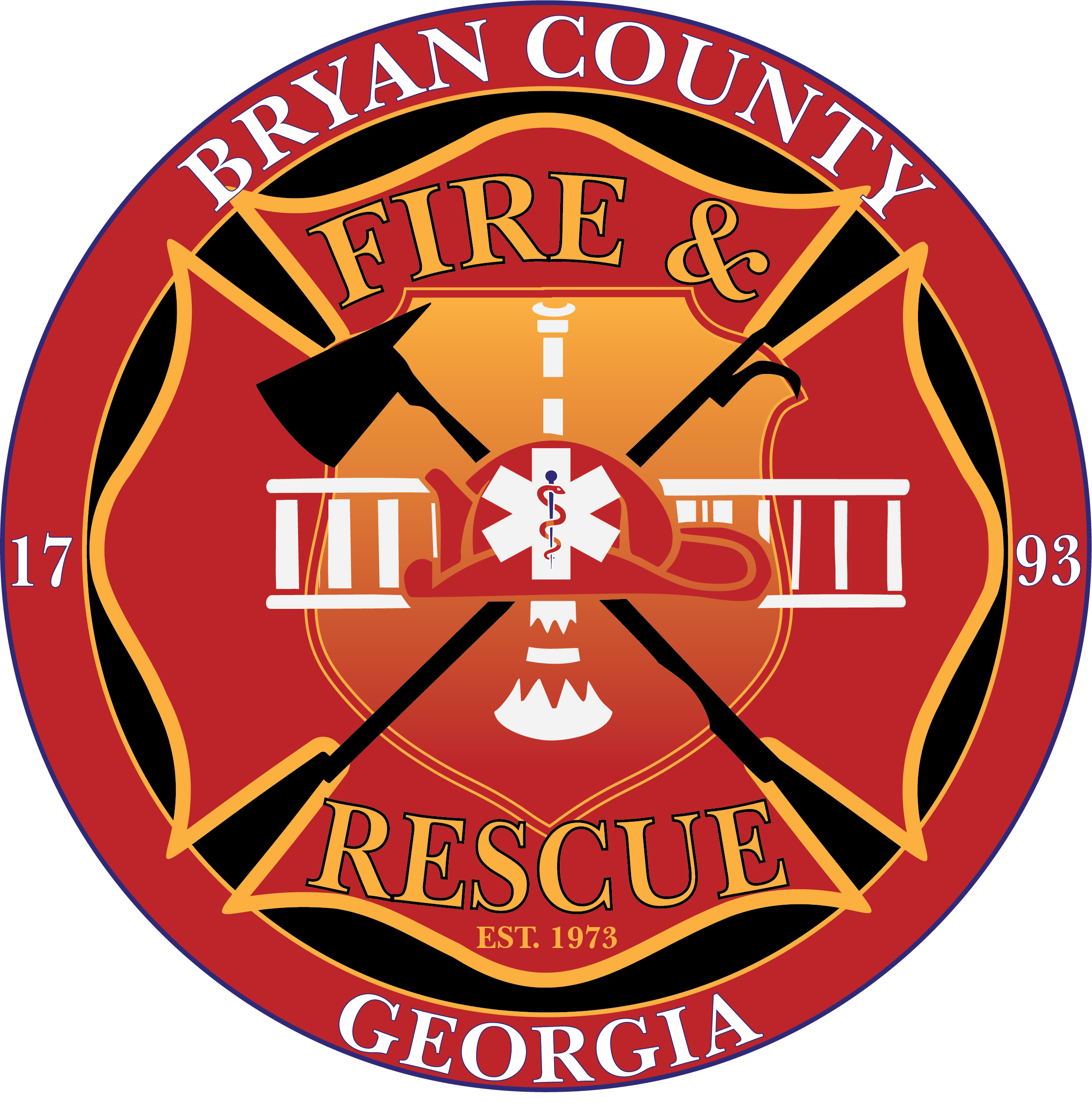
approved Final Logo
Final Approved Design
The final selection chosen by leadership was the red and gold version with black and blue accents, featuring:
The Bryan County logo centered within the fire emblem
Clean, modernized line work
Balanced Fire and EMS service symbolism
Strong color contrast for visibility across uniforms, vehicles, signage, and digital use
The design honors the department’s legacy and community role while delivering a cohesive, contemporary brand identity for long-term use.