
Brand New:
Bryan County Brand Identity & Expansion
Bryan County, rich cultural identity rooted in Southern charm, natural beauty, history, and a strong sense of community; what it lacked was a visual identity that consistently reflected those qualities.
Project Goals
Establish a recognizable visual identity beyond the County seal.
Create consistency across County communications and public touchpoints.
Strengthen community recognition and trust through consistent identity and messaging.
Make official County information easier to recognize across departments and platforms.
Give departments flexibility while maintaining a unified County presence.
Establish practical standards that staff could consistently apply.
Create a scalable identity capable of supporting future digital, print, social, web, and public-facing communications.
More than creating a new look, the project was about building recognition and trust. Calling upon those elements of cultural identity that make Bryan County: welcoming, friendly, hospitable, charming, community-focused, heritage-rich, trustworthy, dependable, professional, service-oriented, and responsive. A consistent visual identity paired with consistent messaging helping residents immediately recognize official County communications, understand where information is coming from, and develop greater familiarity and confidence in the organization serving them.
The Challenge
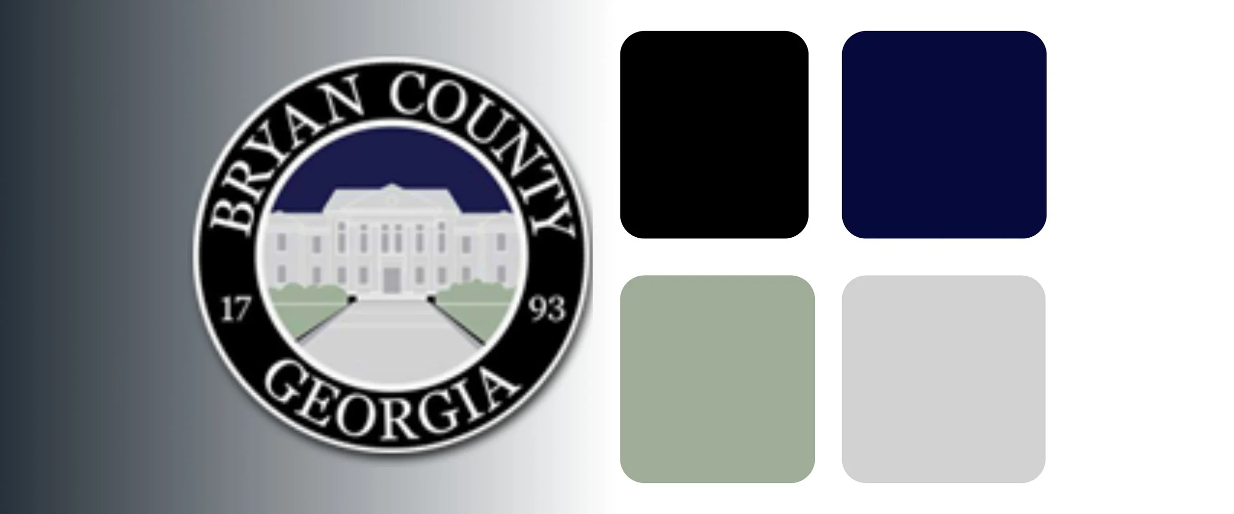
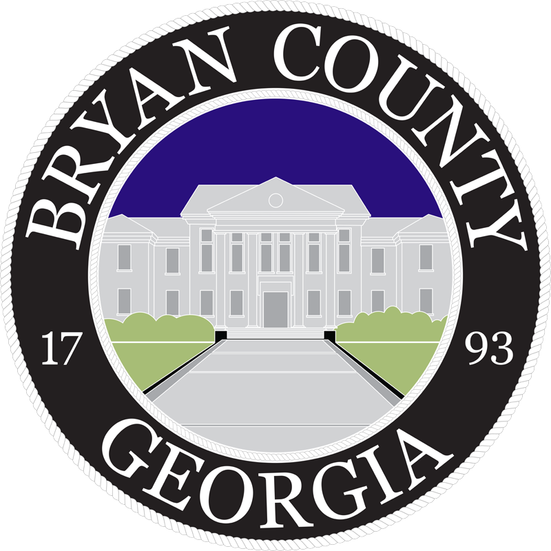
Bryan County had an established seal, but no comprehensive brand system supporting it. The original artwork had also been lost over time, leaving repeatedly duplicated PNG and JPEG files that had become dull and blurry.
At the same time, departments communicated with the public in different ways without a shared visual framework connecting those communications back to Bryan County.
Key Deliverables
Refined and restored Bryan County seal
True SVG/vector master artwork
County-wide color and typography system
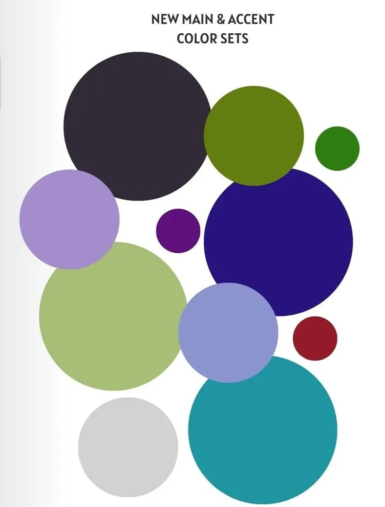
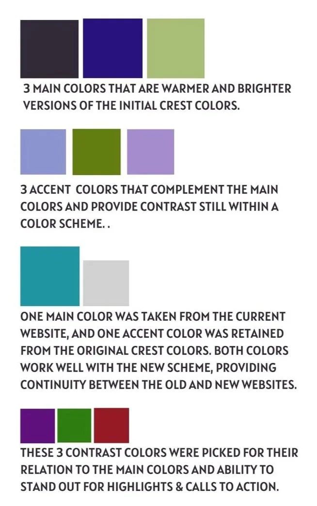
Primary, secondary, and contrast palettes
Color pairing and readability standards
Department-specific brand extensions
Emergency and alert visual hierarchy
Usage rules for text, backgrounds, headers, accents, and calls to action
Templates and real-world application examples
Department brand guides for consistent implementation
My Approach
The existing seal and its history became the starting point rather than something to replace. I refined and brightened the artwork and recreated it as a true vector SVG, providing the County with a scalable master asset again.
From there, I developed a broader visual language inspired by the character of Bryan County itself. The original colors were warmed and expanded with complementary palettes, typography, contrast standards, and usage rules designed to feel welcoming, rooted, professional, and community-focused.
The system was then extended to essential public-facing departments, giving them enough individuality to support their specific missions while maintaining a clear connection to the larger County identity.