
Case Study
One Web.
A County Reimagined.
The Design Issue
The visual system was created to make a large government information ecosystem feel clear, contemporary, and distinctly local. Every layout, interaction, image, and custom component was designed to reduce friction while giving the County a stronger digital identity.
- 01 User Interaction Navigation, page pathways, and responsive interface components.
- 02 Visual Identity Typography, hierarchy, color, graphics, and reusable layouts.
- 03 Original Media Photography, video, custom imagery, and multimedia storytelling.
A visual study in civic design — where service strategy, user interaction, and original creative work converge.
ONE WEB.
A COUNTY
REIMAGINED.
THE DESIGN ISSUE
The visual system was created to make a large government information ecosystem feel clear, contemporary, and distinctly local. Every layout, interaction, image, and custom component was designed to reduce friction while giving the County a stronger digital identity.
01 — USER INTERACTION Navigation, page pathways, and responsive interface components.
02 — VISUAL IDENTITY Typography, hierarchy, color, graphics, and reusable layouts.
03 — ORIGINAL MEDIA Photography, video, custom imagery, and multimedia storytelling.
A visual study in civic design—where service strategy, user interaction, and original creative work converge.
01 / USER INTERACTION / NAVIGATION
FROM STRUCTURE TO SERVICE
The existing navigation used tight line spacing and a hierarchy that made relationships between pages difficult to discern. The initial replacement platform introduced more color, but its rigid structure limited how far the experience could evolve.
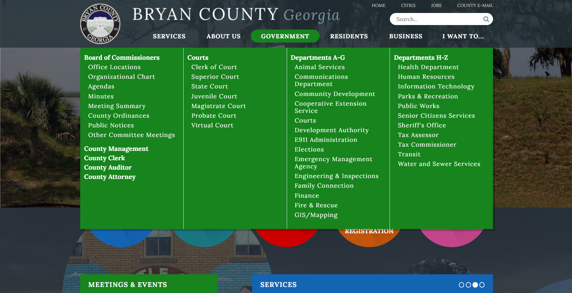
Within the selected CMS, navigation was redesigned around the different ways residents, businesses, and visitors search for information. Multiple pathways lead users to the same authoritative content, while each major menu section opens with a short explanation of what visitors will find and how the available links serve them.
BEFORE Dense hierarchy, limited visual separation, and fewer contextual cues.
AFTER Clearer pathways, descriptive guidance, section colors, and matching calls to action.
02 / VISUAL CONTINUITY / COLOR + ICONS
FAMILIAR, REFINED.
The palette began with colors from the original website and evolved through the branding guide. The initial replacement platform had been modified to introduce more color; within the selected CMS, the palette became richer and more deliberate—still warm and light, but more restrained than the earlier direction.
Each primary menu section uses a color from the branding guide, supported by matching buttons and interface accents. This creates continuity while helping visitors recognize where they are within the site.
A CIRCLE, REIMAGINED
Custom icons were designed as a callback to the circles used on the original site—sleeker, more modern, and built for interaction. Custom-coded animation adds movement and responsiveness, transforming a familiar visual reference into an engaging interface system.
03 / IDENTITY IN PRACTICE / DEPARTMENTS + PLACE
ONE COUNTY. MANY VOICES.
Departments with a significant role in citizen interaction were designed to remain individually recognizable within one shared system. Department logos and collaborative brand colors were incorporated into the same underlying layout, preserving identity without fragmenting the County experience.
Consistent structure, spacing, navigation patterns, and content hierarchy allow visitors to move between departments without having to relearn the interface. Color and identity become orientation tools rather than competing design systems.
A VISUAL SENSE OF PLACE
Custom banners were created for individual sections and subject areas. Whenever possible, the imagery captures recognizable locations, services, landscapes, and everyday scenes from within Bryan County—giving each page context while making the overall experience feel warm, engaging, and unmistakably local.